Most 3D and spatial UX doesn’t fail loudly.
It fails quietly through confusion, fatigue, or abandonment.
Not because the technology is immature, but because UX decisions don’t scale automatically into space.
In Part 1, we talked about principles.
In Part 2, we’ll look at how those principles show up in real products and where they break down.
Want more like this? Subscribe to get my free UX prompt guide for designing with AI and join the exploration.
Case Category 1: 3D in Product & E-commerce UX
When It Works 😎
Example pattern:
Interactive 3D product views that replace static image galleries.
What works well:
User-controlled rotation (no auto-spin)
Clear affordances (“drag to rotate”)
Limited interaction scope
3D answers a specific question: size, fit, or form
Here, 3D reduces uncertainty.
It helps users make decisions faster, not admire visuals longer.
UX principle applied:
👉 Depth reduces effort.
Example: Nike 360° Product Exploration
AI can generate photorealistic 3D shoe models and multiple colour-ways in minutes.
Humans decide which views are meaningful, how rotation is controlled, and which interactions clarify size or fit.
UX Principle: Depth reduces effort
AI role: Rapid asset generation and variation
Human role: Selecting orientation, motion, and interaction clarity

💡 Business impact
By reducing sizing uncertainty, Nike cut returns by up to 20% and improved conversion rates showing how design-led confidence at checkout directly impacts revenue and operational costs.
When It Fails 😞
Example pattern:
Auto-rotating 3D models embedded by default.
What goes wrong:
Motion without intent
No explanation of interaction
Cognitive overload on entry
Performance issues disguised as “immersive experience”
Instead of clarity, users get distraction.
UX lesson:
3D should be invited, not forced.
Case Category 2: Augmented Reality (AR) Interfaces
When It Works 😎
Example pattern:
AR used for contextual guidance—navigation, measurement, or placement.
Why it succeeds:
Overlays appear only when needed
Visuals are lightweight and restrained
AR clarifies reality instead of replacing it
The user remains grounded in their environment.
AR acts as an assistant, not a performer.
UX principle applied:
👉 Orientation before interaction.
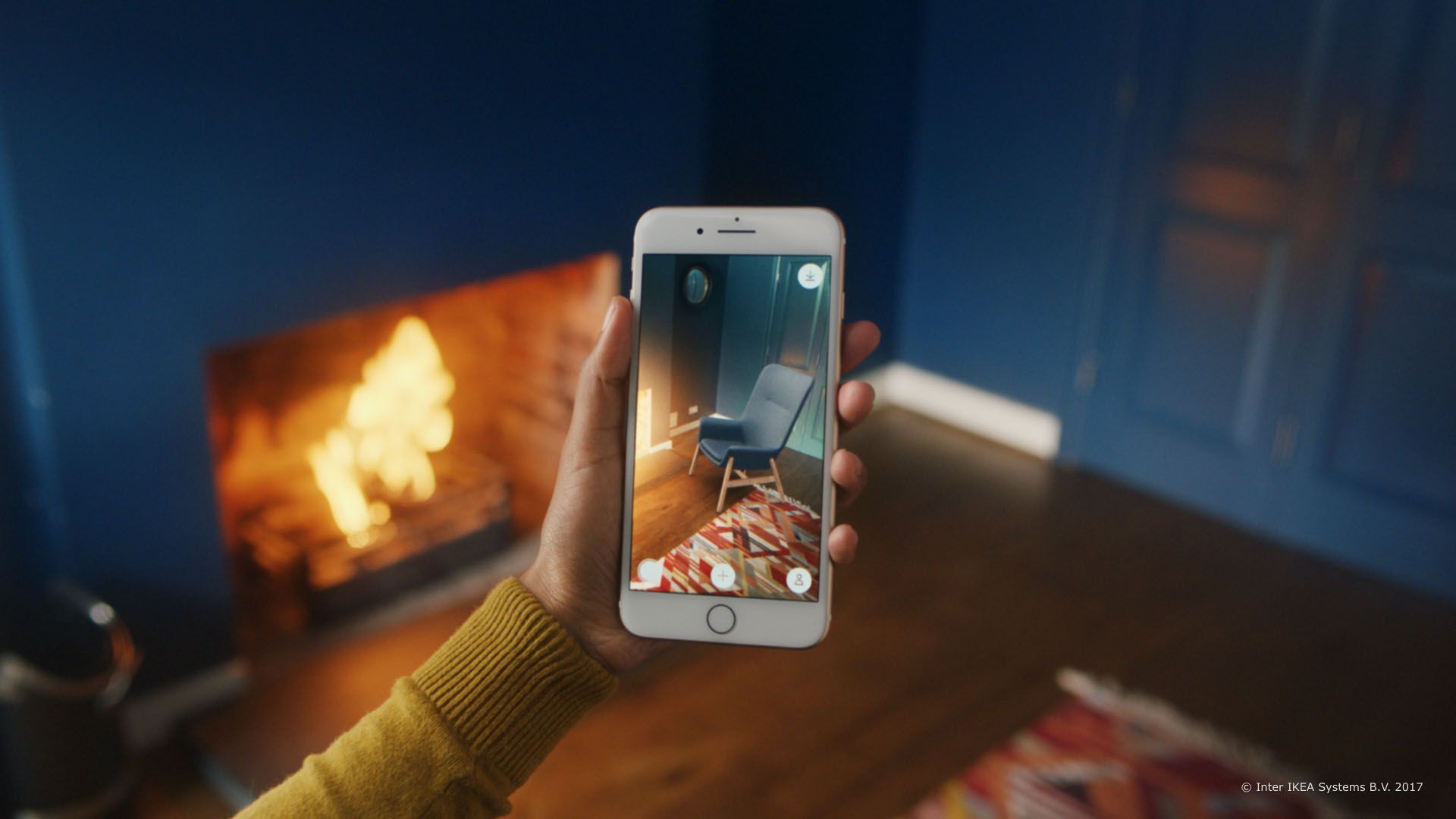
Example: IKEA Place
AI helps scale furniture accurately to a room’s dimensions using computer vision.
Human designers ensure the AR overlay communicates clearly — orientation, scale, and interaction cues.
UX Principle: Orientation before interaction
AI role: Spatial measurement and asset placement
Human role: Interaction clarity and user guidance

💡 Business impact
IKEA Place helped turn augmented reality into measurable business value: customers using the app saw up to a 35% increase in online sales, were 11% more likely to complete a purchase, and returned furniture around 20–23% less often compared to traditional browsing experiences.
By reducing uncertainty about fit and scale, AR boosted confidence, lifted conversions, and cut costly returns - proving that immersive design isn’t just a feature, it’s a strategic growth driver.
When It Fails 😞
Example pattern:
Persistent AR overlays competing for attention.
Common issues:
Visual clutter
Too many floating elements
No prioritisation
User fatigue within minutes
The interface demands attention instead of supporting action.
UX lesson:
AR should respect reality, not dominate it.
Case Category 3: VR & Spatial Workflows
When It Works 😎
Example pattern:
Task-specific VR experiences—training, simulation, or focused collaboration.
What they get right:
Clear session boundaries
Purpose-built interactions
Minimal UI
Strong spatial anchors
These experiences don’t try to be everything.
They are opinionated, scoped, and intentional.
UX principle applied:
👉 Comfort is a UX requirement.
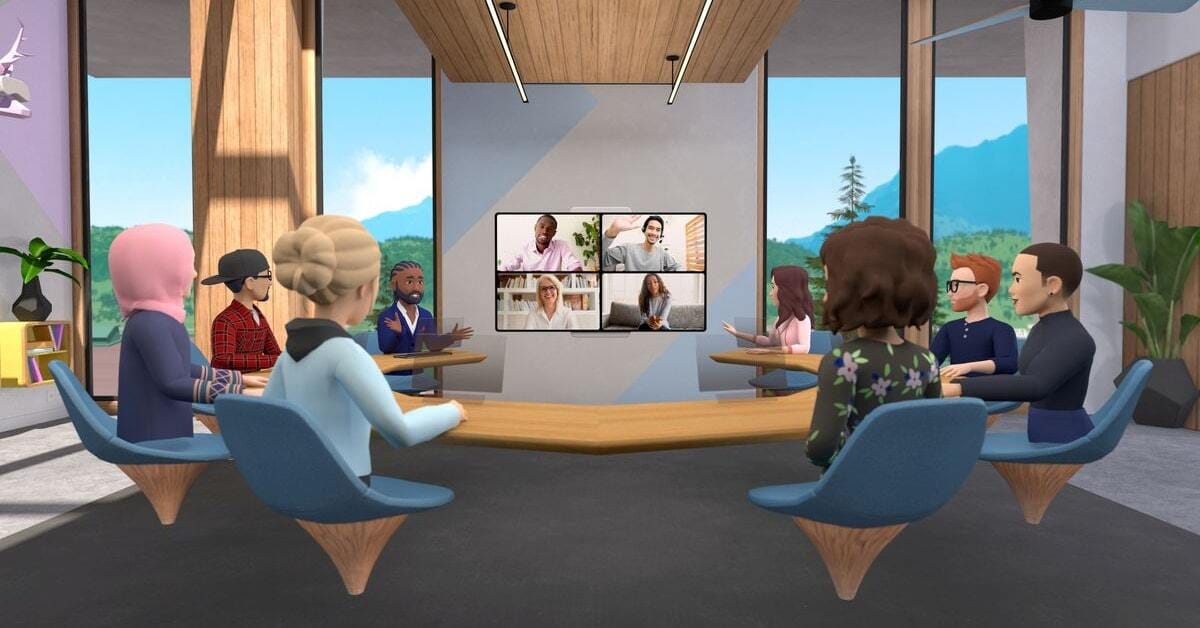
Example: Horizon Workrooms (Meta VR)
AI assists in rendering environments and avatars realistically.
Humans decide interaction scope, session length, and spatial anchors to prevent fatigue.
UX Principle: Comfort is a UX requirement
AI role: Asset rendering and variation
Human role: Spatial design, interaction pacing, and accessibility

💡 Business impact
Horizon Workrooms shows how immersive design shifts collaboration from seeing faces to sharing presence. While Meta hasn’t published direct revenue KPIs for Workrooms alone, enterprise VR studies tied to Meta’s ecosystem report up to 75% faster training, higher engagement than video calls, and meaningful reductions in travel and workshop costs. The value isn’t novelty - it’s fewer disconnected meetings, faster alignment, and better knowledge transfer in distributed teams. In this context, VR becomes an efficiency multiplier, not a futuristic extra.
When It Fails 😞
Example pattern:
2D interfaces “ported” into 3D space.
Symptoms:
Floating panels
Endless menus
Long sessions
Interaction fatigue
Nothing is gained by depth.
Everything becomes harder.
UX lesson:
If a workflow works best on a screen, forcing it into VR is not innovation.
Case Category 4: Hybrid 2D + 3D Interfaces
When It Works 😎
Example pattern:
3D used sparingly to explain structure, hierarchy, or relationships.
Why it works:
2D remains the backbone
3D adds meaning, not noise
Motion communicates state changes
These interfaces feel modern but familiar.
UX principle applied:
👉 Motion is language, not ornament.
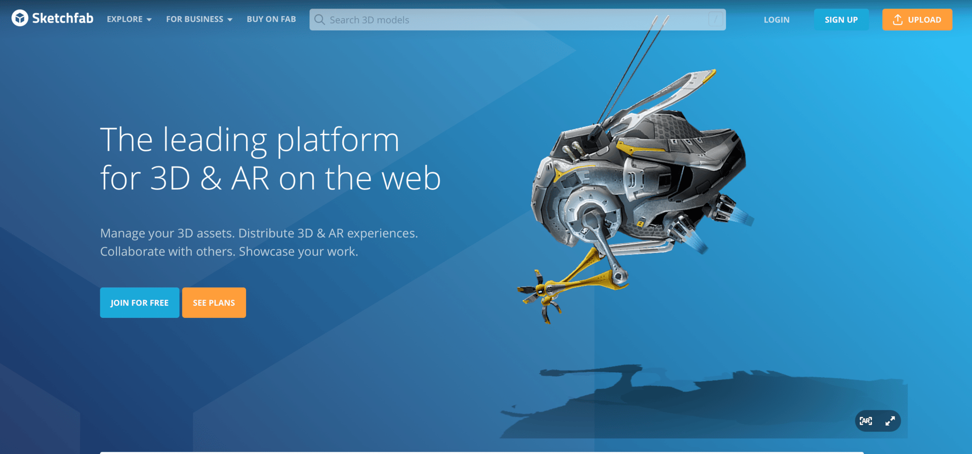
Example: Sketchfab 3D Model Viewer
AI-assisted rendering and compression make interactive 3D models fast.
Humans select which models to display, how they’re oriented, and which interactions communicate value.
UX Principle: Motion is language, not ornament
AI role: Rendering and optimising 3D content
Human role: Curating interaction and information hierarchy

💡 Business impact
Hybrid 2D + 3D interfaces work when motion explains value. With Sketchfab-style viewers, curated interactivity has been linked to ~25% higher buying intent and significantly deeper engagement, turning 3D from visual novelty into a conversion tool.
When It Fails 😞
Example pattern:
3D added as visual flair without functional purpose.
What happens:
Slower interactions
Increased cognitive load
No clear benefit over 2D
The interface looks impressive.
The experience feels heavier.
UX lesson:
If users can’t articulate why 3D helps, it probably doesn’t.
Where AI Fits Into These Examples
AI shows up consistently across both good and bad cases but not as the deciding factor.
AI helps by:
Generating assets faster
Exploring variations
Reducing production cost
AI fails when:
It drives structure
It replaces judgment
It accelerates bad decisions
AI can generate environments.
UX defines experiences.
The difference between success and failure is never the tool.
It’s the design intent.
The Pattern Behind Success
Across all successful examples, the same signals appear:
Clear purpose
Limited scope
Respect for human perception
Restraint over spectacle
Good spatial UX doesn’t shout.
It settles.
Designing for Space Is Designing for Responsibility
As interfaces move from screens to spaces, designers don’t just design interactions.
They design how users feel inside systems.
Disorientation, fatigue, and confusion aren’t technical problems.
They’re UX signals.
The future of UX isn’t flatter or deeper.
It’s more intentional.
And in spatial interfaces, intent is felt immediately.
Final Thought
3D and extended reality aren’t the future of every interface.
But they are the future of some interactions.
The designers who succeed won’t be the ones who adopt 3D fastest.
They’ll be the ones who know when not to use it.
👉 And if you haven’t yet, subscribe here to get my free UX prompt guide for designing with AI - it’s the easiest way to keep exploring with me.


